When a regression equation is calculated, the graphing calculator is trying to find the line or curve that best fits the data.
The graphing calculator finds the line or curve that goes through the greatest number of points, while minimizing the distance between the other points and the line or curve itself. This is the line of best fit.
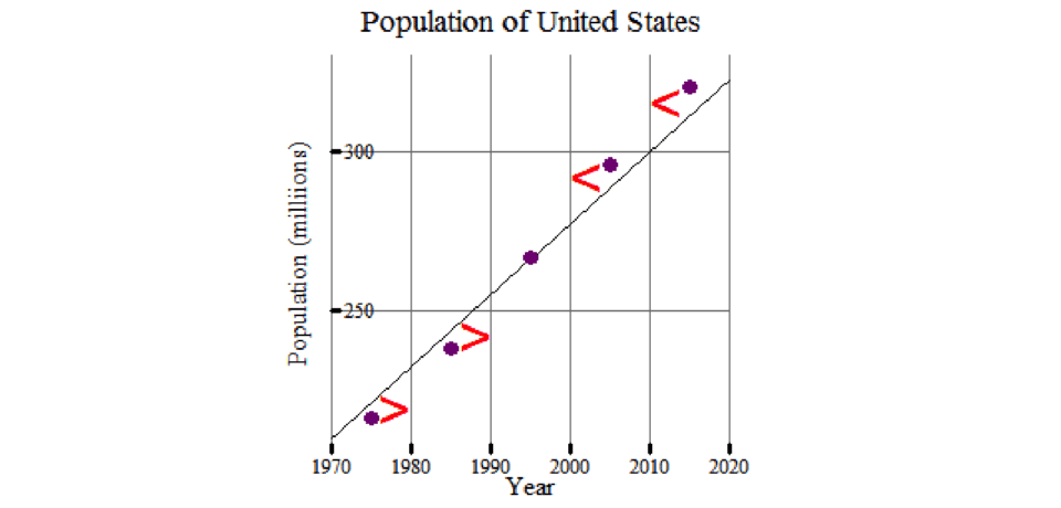
Shown here is a close-up view of the same linear regression as the line of best fit, with a focus on data between x = 1970, and x = 2020.
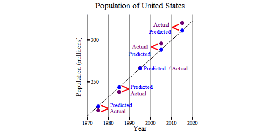
The equation of the line (or curve) of best fit predicts data values while the points in the scatterplot represent the real data values.

The regression equation best predicts the data values because it minimizes the difference between the actual values and the predicted values along the line/curve. Refer to the previous slide to revisit the graph.
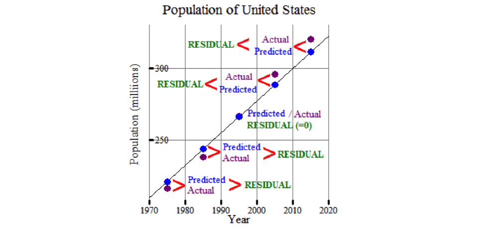
The difference between the actual value of each point on the scatterplot and the regression equation’s predicted value is a residual.
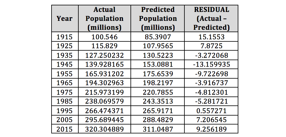
This table shows the difference between the actual data values and the calculated values using the regression equation.
A residual plot is a graph of the data’s independent variable values (x) and the corresponding residual values.
When a regression line (or curve) fits the data well, the residual plot has a relatively equal amount of points above and below the x-axis. Also, the points on the residual plot make no distinct pattern.
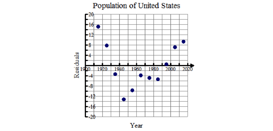
On this residual plot, do the points create a pattern? How many points are above the x-axis? How many points are below the x-axis?
The residual plot made from the linear regression shows a U-shaped pattern. Also, more points fall below the x-axis than above it. This means that a linear regression is not a good model for the United States population growth.
A non-linear curve, such as an exponential or quadratic curve, may be a
better fit.
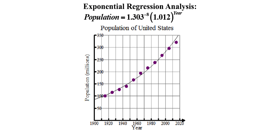
Finally, let’s look at the exponential regression analysis and the exponential regression residual plot.
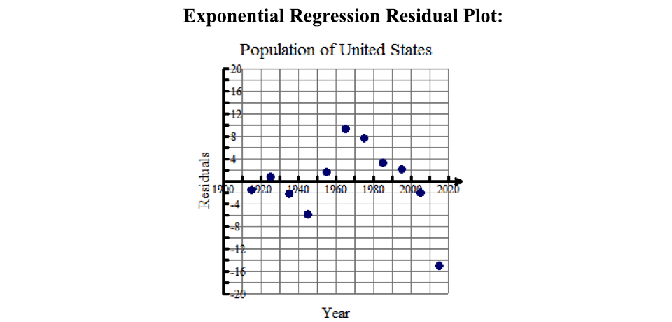
Here is the resulting residual plot for the exponential regression.
On this residual plot, do the points create a pattern? How many points are above the x-axis? How many points are below the x-axis?
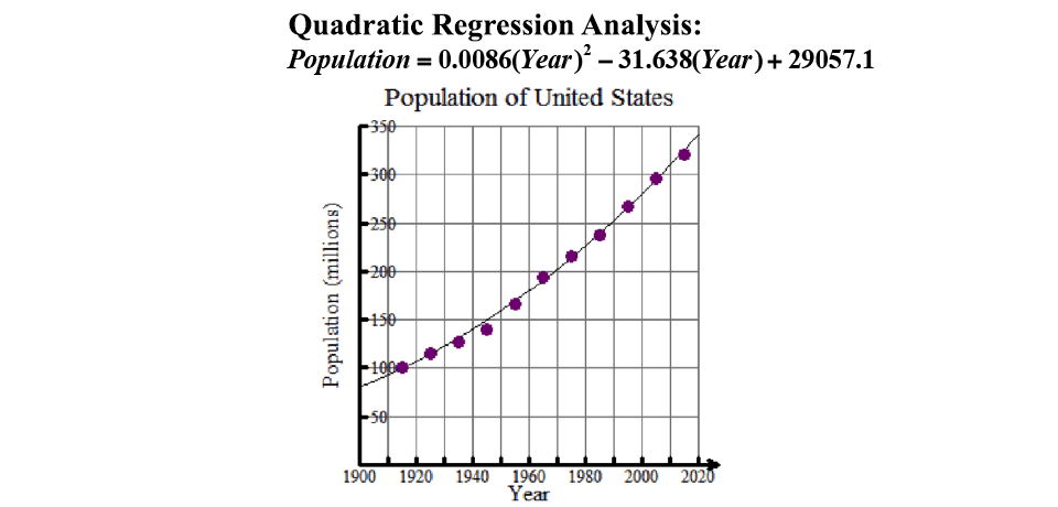
Next, let’s look at the quadratic regression analysis and the quadratic regression residual plot.

Here is the resulting residual plot for the quadratic regression.
On this residual plot, do the points create a pattern? How many points are above the x-axis? How many points are below the x-axis?

Compare the exponential regression residual plot with the quadratic regression residual plot.
The exponential regression residual plot shows the residuals more scattered about, with the least amount of pattern, when compared to the quadratic fit. In other words, the exponential regression results in the weakest correlation between the residuals and the independent variable (x).
In addition, the exponential regression residual plot has a relatively equal dispersion of points above and below the x-axis. The quadratic residual plot has more points above the x-axis than below it.
Close examination and comparison of these three regression models (linear, exponential, quadratic) and their residual plots indicate that the population growth of the United States between 1915 and 2015 is best modeled by an exponential regression curve.